by Gabriel Albo
Late on 2014 we’ve had a workshop to define Pixelated’s visual (and brand) identity. The workshop was facilitate by Samantha Rosa and some members of the project in Brazil, visual designers and marketing focused friends participated.
Most pictures will show post-its and text in Portuguese, but English translations will follow.
THE ELEVATOR PITCH
After explaining the project to the participants, we ran an exercise to define an elevator pitch for the brand.
Pixelated is a free, open source email solution that allows sending emails on an easy and private way, being the emails encrypted or not.
QUALITIES
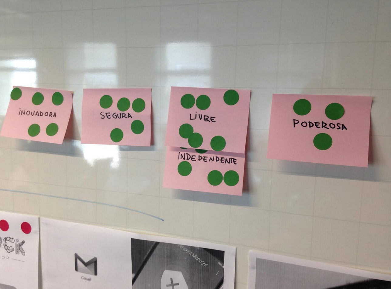
We then proceeded to analyse qualities that reflected, in our opinions, what Pixelated is. Amongst many characteristics that were presented (such as “independent”, “smart”, “young”, “international”, etc.), participants voted what concepts made sense to them when thinking of Pixelated.
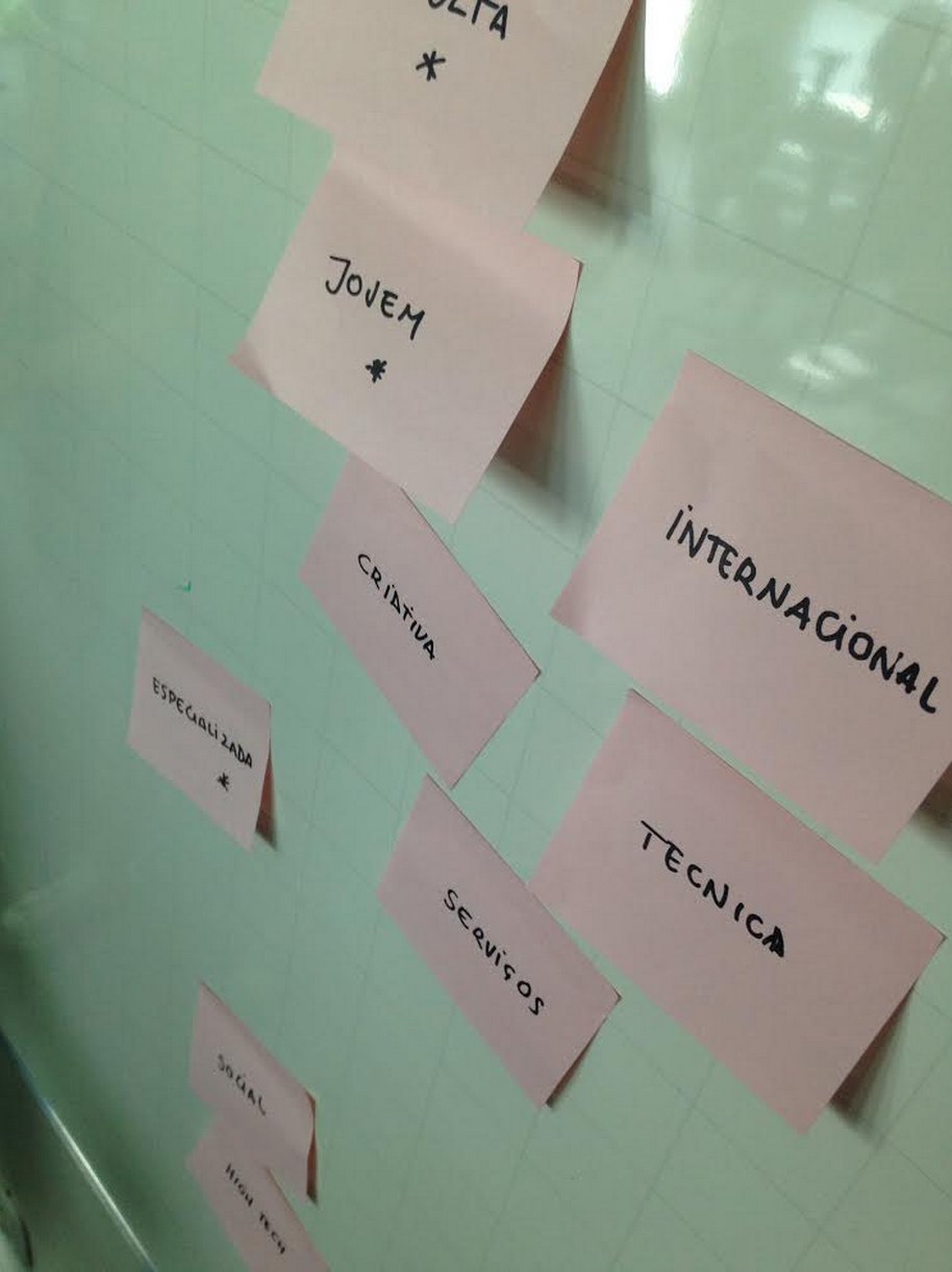
The top voted ones were
- Innovative
- Secure
- Free/independent
- Powerful
LOGO STYLES EVALUATION
We then hung many logo styles on the wall and people voted up (green dots) and down (red dots) their favorite ones having the four concepts above in mind - “what types of logos convey those ideas to you?”
Then we analyzed positive and negative characteristics of the logos we voted up and down. Positive and negative, in this context, means “aligned with the Pixelated values we listed”, not a stylistic evaluation of the logos.
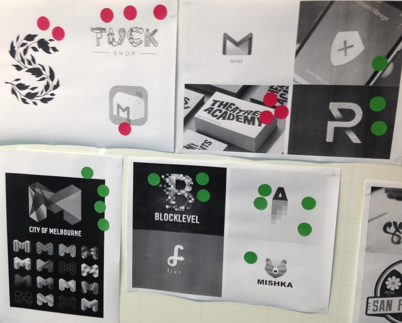
NEGATIVE ASPECTS: Organic, fragile, vintage, traditional, non-innovative, insecure, unstable.
POSITIVE ASPECTS: Solid, neutral, dynamic, transformational, geometric, powerful, free, planned, intentional, foldable/adaptable, resistant.
During the discussion, a metaphor used to explain their view of Pixelated was animals that could serve as mascots for it; a pig and a bear were mentioned, but ants made sense for many of us, as in organized, strong, collaborative, adaptable and still independent.
BRAND PERSONA
We then proceeded to list how we pictured Pixelated, were it a person. Some of the things we converged to:
- Speaks out when something is important, but keeps less important things in the background
- Serious (but not harsh)
- Conveys security, trust
- Intelligent
- Clear on the messages
- Accessible to talk to
- Organized
- Friendly tone of voice (but not necessarily funny)
The image the participants drew was of a young adult lesbian mother in her 30’s, as she might is not a conventional figure for many, but she is just as strong, independent and caring as any other mother.
“She might remind you to bring a coat with you if it’s too cold, but you might just find out she packed a coat for you without you even knowing”
LOGO SKETCHING
Having set the tone and image we wanted to convey, we went on to the next stage, which was sketching our logo.
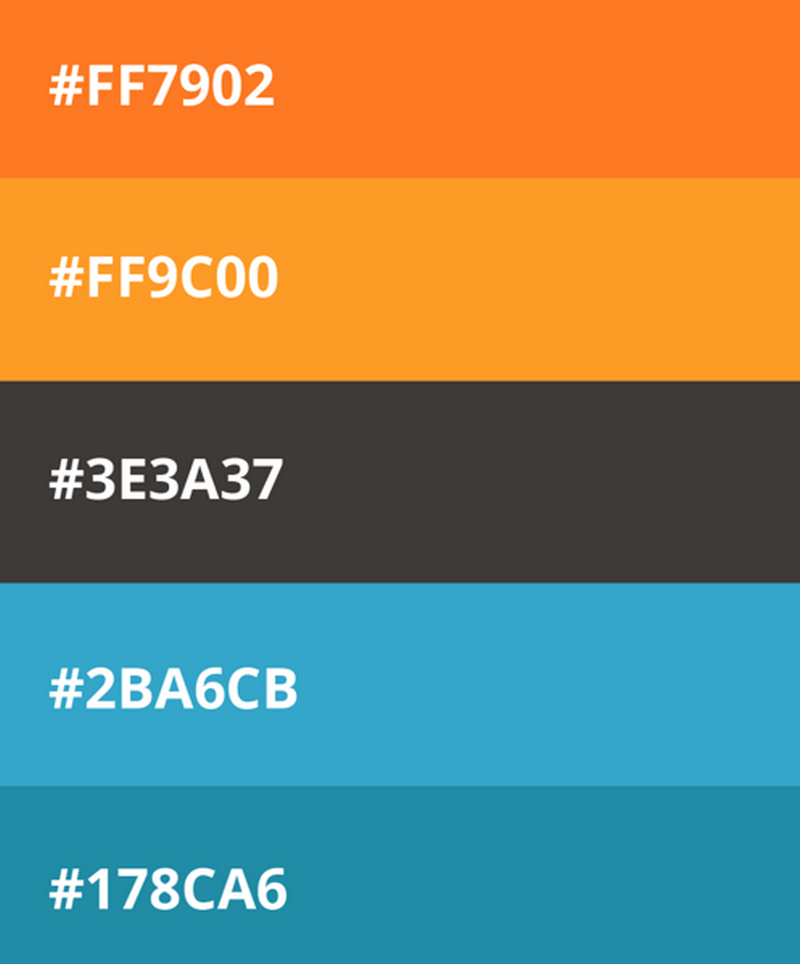
Myself and Letícia Nunes, our extremely talented visual designer friend, had already, defined our color palette based on the first ideas we wanted for the project. Here it was:
We’ve also already had played around with a couple ideas to get feedback, which were the following:
We wanted to set the tone for which direction we wanted to go for, so we publicly asked for feedback about those first ideas. Adding all the discoveries from the workshop and ideas from other contributors, these are some of the sketches we came up with:
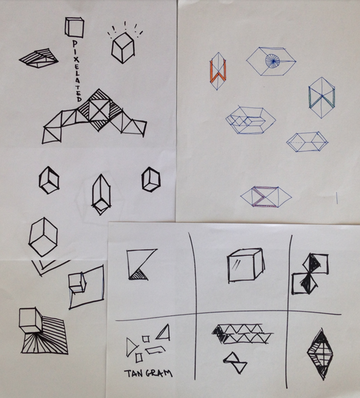
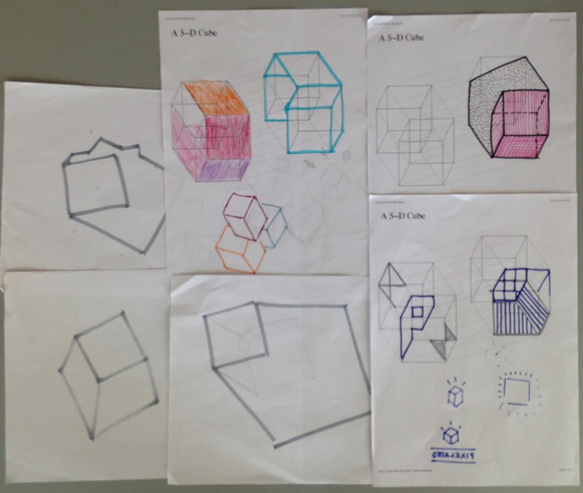
(We even built some 3D cubes and started shedding light on it to play with its shadows, too :))
The straight lines and the cube figure became a constant for us as we could see the cube as the solid, stable and independent - yet groupable - entity we wanted Pixelated to feel like. So we went to the computer and started diverging on several ideas:
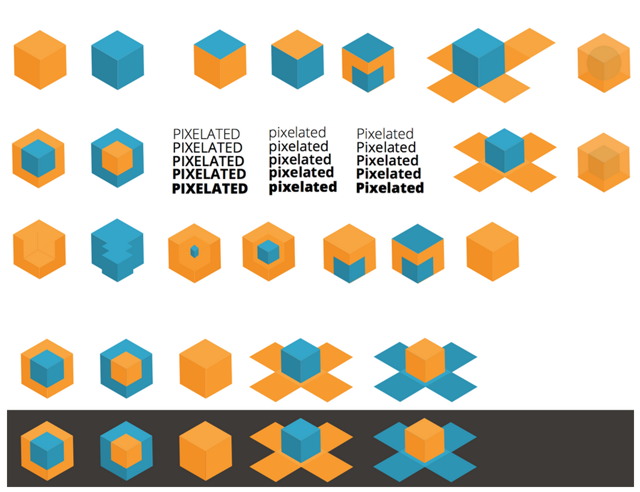
From there, we’ve narrowed down to ideas around having a cube with some sort of “shield” around it - a way to communicate the solid, stable state of emails with this protection around them.
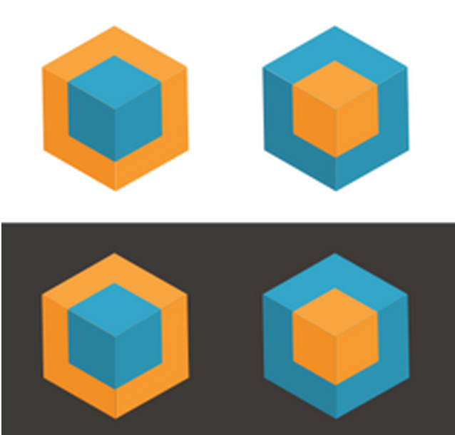
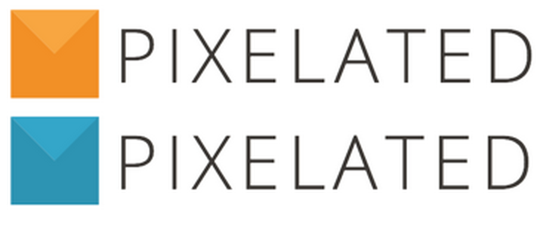
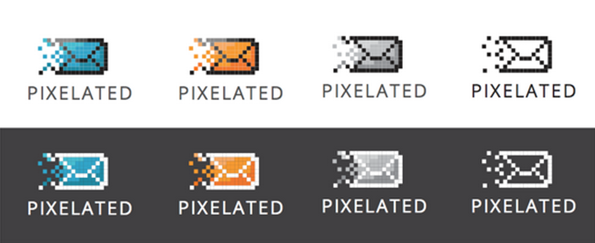
Finally, we’ve settled with the following one (and its variations):
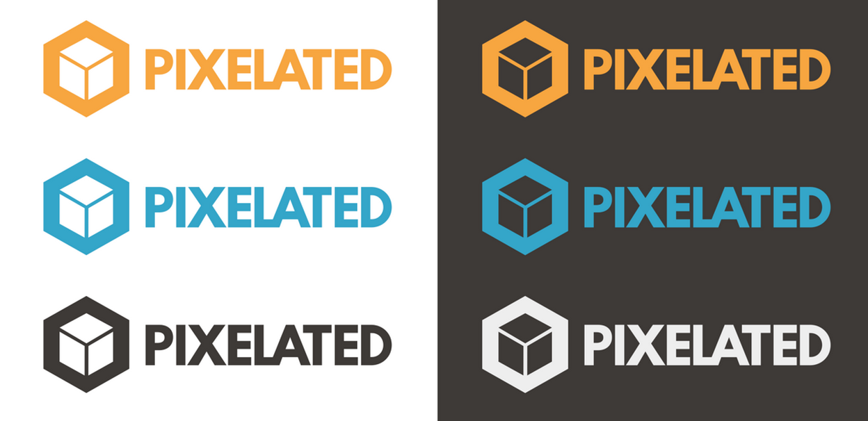
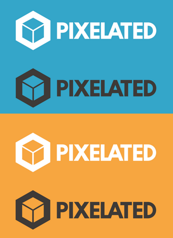
We’re still counting the “shield” ones as official logos, but focusing more on the final, one-colored versions, for their easy adaptability.
After the first few weeks and some feedbacks around other similar logos in orange, we decided to keep using them all, but emphasizing the blue one.
CONCLUSIONS
As this is an open source software, we also want it to be an open design software; despite the hard work we put on defining these directions, our intention is never to settle or consider anything finished, as Pixelated’s ID must reflect its state, which is bound for a more organic evolution than most software products. We do, however, believe the current directions are broad and adaptable enough for creating as many varieties as we might think we need for quite a while.